Note Compliant elements:
A pictogram is usually optional, but if used must be in a 6″ tall clear field.
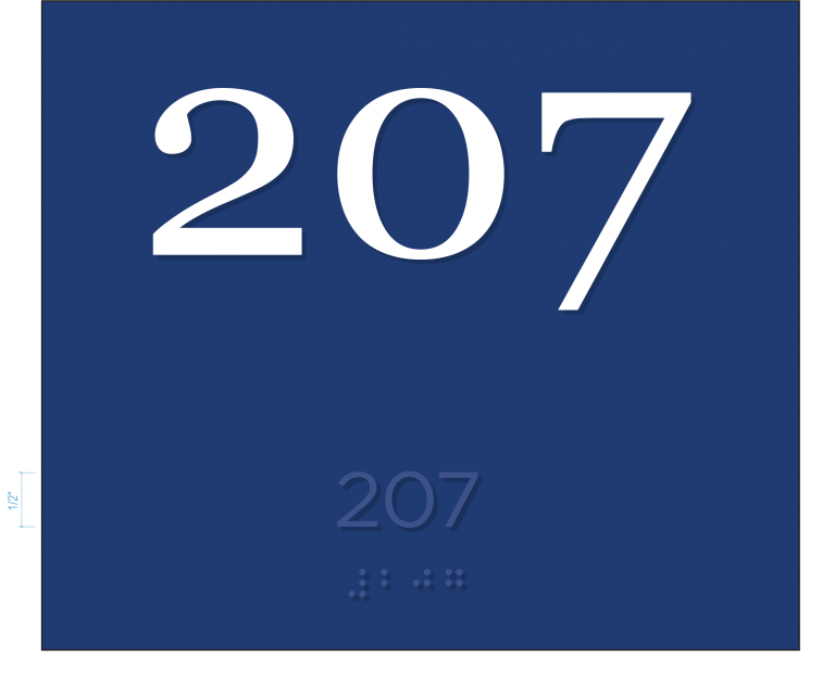
Text translation (“descriptor”) beneath pictogram.
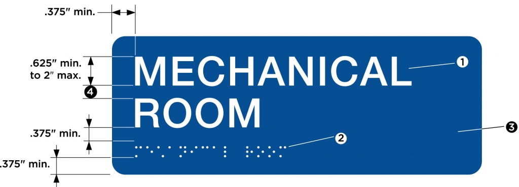
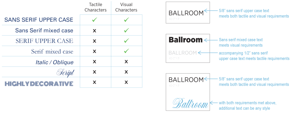
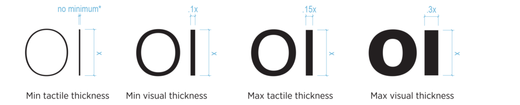
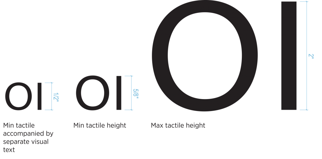
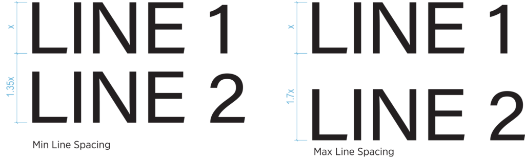
The text meets both tactile and visual requirements.
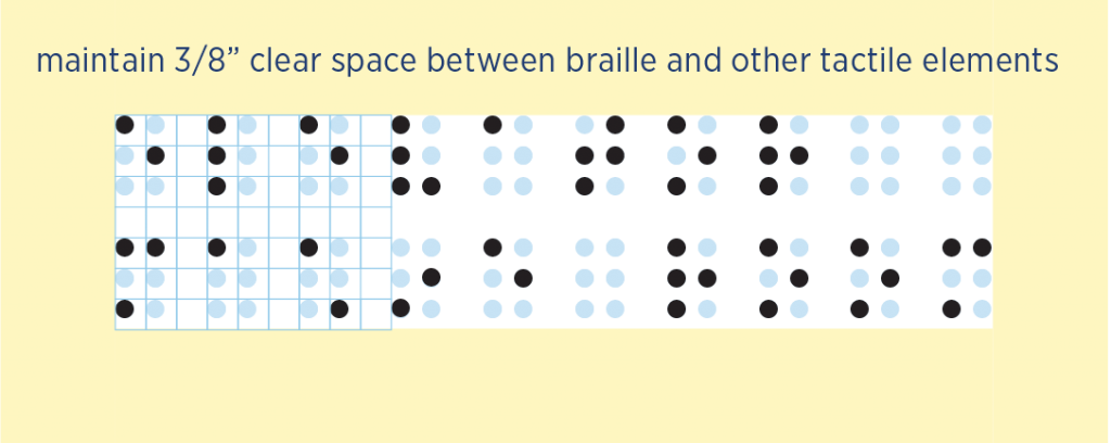
Braille translation beneath the text.
3/8″ clear space around braille.
The pictogram can be tactile or a flat graphic.
See Full Image